01. The Problem
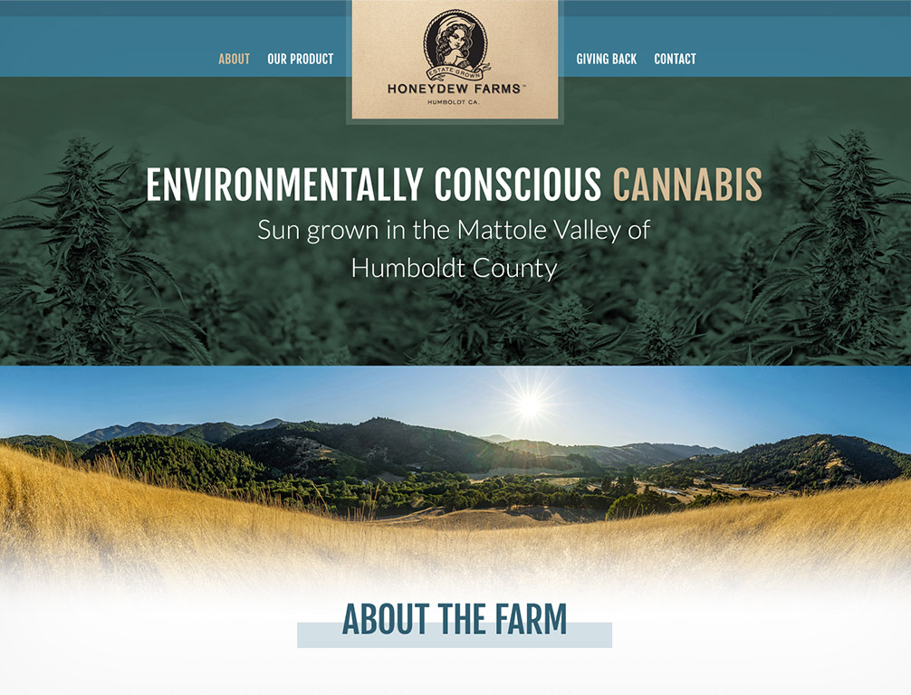
A colleague of mine who knew and liked my design aesthetic came to me with a project to help his family business get online. His relatives ran one of the largest and most successful cannabis farms in California, Honeydew Farms.
They had a logo they were firm on keeping, but the rest of the branding was given to me to develop. To clarify, I was only being tasked with developing the extended branding and designing Photoshop templates for the homepage and interiors. My friend was going to take those comps and code the WordPress backbone for free to save his family money. After some hearty research, I established a basic color palette and typography style that I thought would serve their needs well.

02. The Solution
Luckily for me, I was given access to an amazing repo of high resolution, superb photographs of everything from macro shots of the plants to gorgeous wide shots of the farm and general California coast they’d taken.
Using my color palette, I created a staggered combination of sections: Some used the full color photography in all its splendor, sometimes knocked back, and in other sections I leveraged the brand palette to create vibrant duotone textures for use behind section content and type. What we landed on after several rounds of iteration was a deliciously clean, minimal, but engaging and rich series of PSD layout template designs.

03. The Process
Researching the “personality” as it were of the easy-breezy California vibe was actually a really fun part of the process. I landed on something inspired by the brand Marine Layer’s online presence.
Not only had I liked their clothing for years (also introduced to me by the same friend!), but I’d always been a fan of their clean lines, textures and general branding style. That informed a lot of the choices I made.
The only sticking point was working around the existing Honeydew Farms logo which was kind of an almost Old West themed graphic. Massaging it into the clean and modern design system I was after (and which had resonated well with the clients) was challenging, but I came up with several ways to blend it into the new site’s direction without losing the identity altogether along the way.
I think what we ultimately came up with was a shining success!