01. The Problem
By the very late 2010s, Environmental Defense Fund (EDF) had not undergone a major website redesign at EDF.org since 2011/2012 (before I’d even started working there), leaving the site feeling outdated and disconnected from modern web standards.
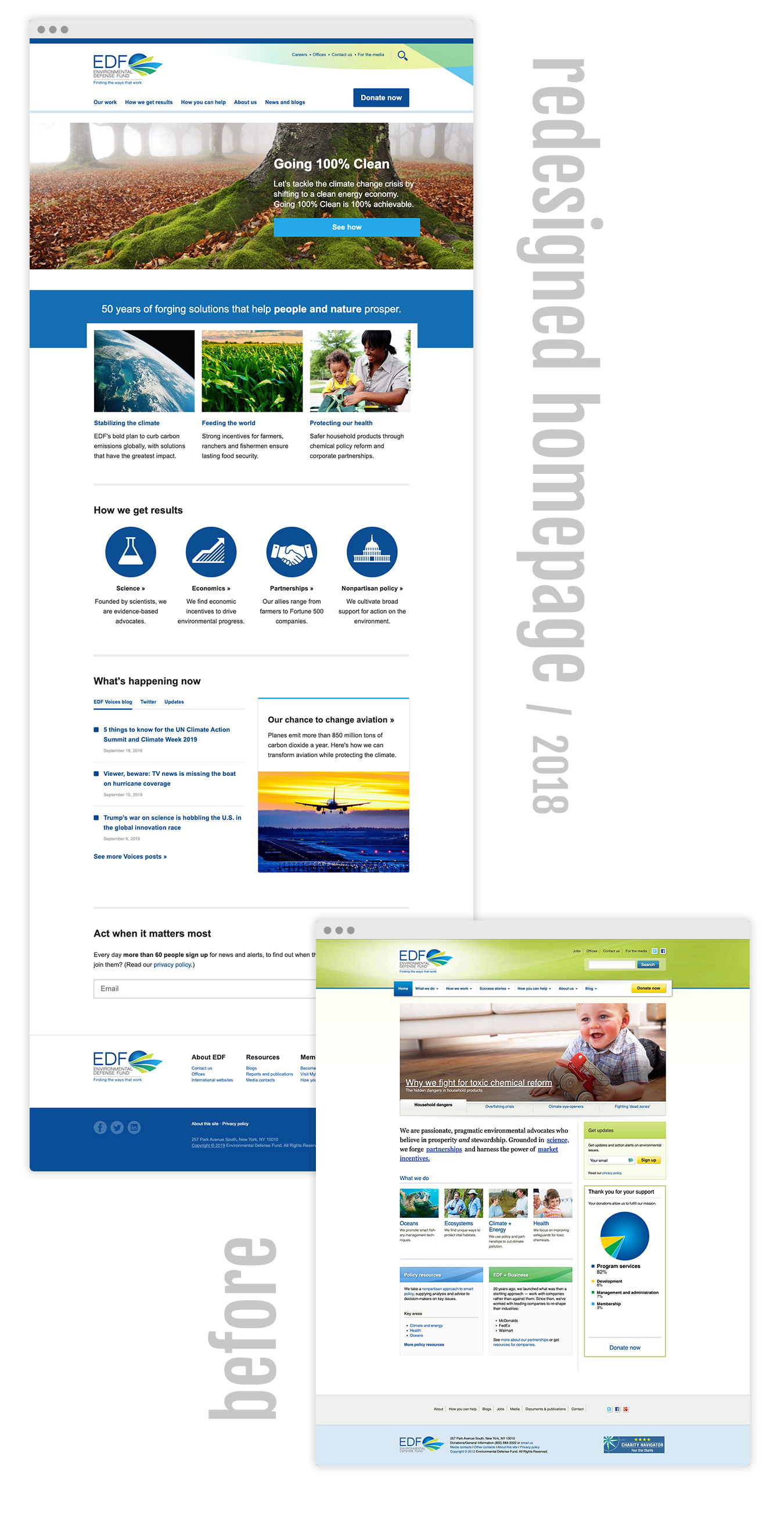
The site’s design was stale, lacking the clean, flat aesthetic that was becoming the norm for contemporary websites. It needed a definite facelift! See a quick example the final homepage redesign compared to the old version below.
Compounding the complexity, the pending back-end upgrade to Drupal 8 presented both a challenge and an opportunity to address these design and usability concerns in tandem. It was shaping up to be quite a project!
02. The Solution
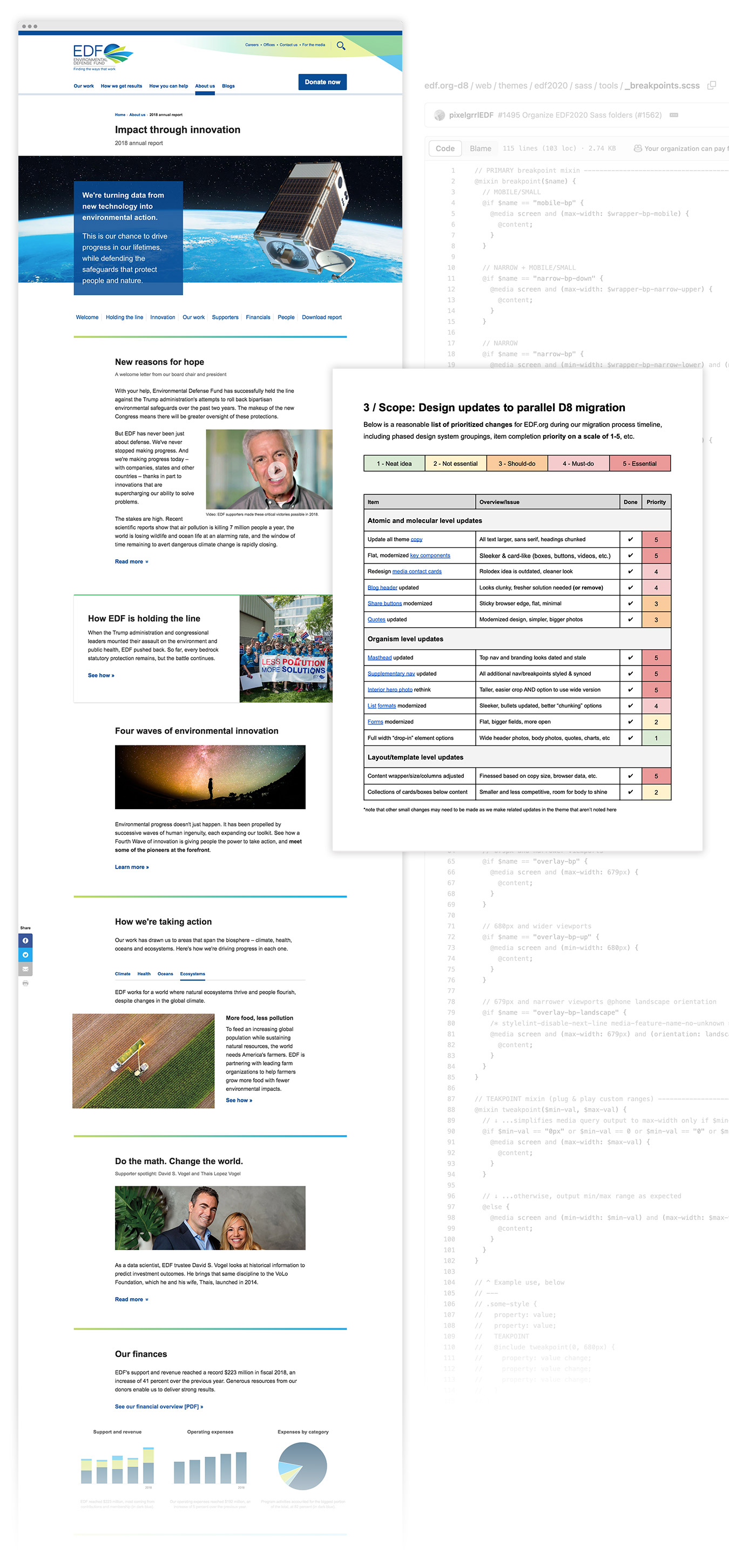
To tackle these refresh issues, I worked with my managers and established clear objectives and priorities using OKRs (Objectives & Key Results) to focus on the most critical front-end improvements. We embraced atomic design principles, allowing for a modular and scalable design system that would serve EDF’s diverse content needs. The color-coded working documentation spreadsheet for this speaks volumes.
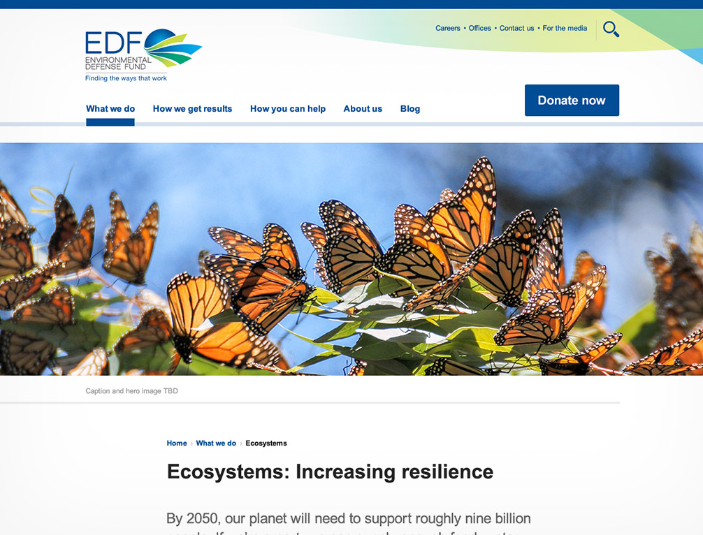
Brand motifs were reimagined in a fresh way to modernize the user interface while retaining EDF’s identity. The site header got the biggest upgrade between the masthead and the new minimal nav with mega menus. We reimagined the design system as a completely modular, responsive pattern library that allowed for many reusable code snippets, in particular on the yearly annual report.
Simultaneously, I updated the site’s front-end CSS/Sass architecture, improving maintainability and performance. By theming and building in parallel with the Drupal 8 upgrade, we ensured that design and functionality progressed cohesively, setting the foundation for a more future-proof website. Several large projects that lived on the site looked beautiful in their new, modular, clean redesign (hero imagery, chunking of the general page content, annual reports as mentioned, etc.)
03. The Process
While we hit our deadline and came out with a beautiful new site and happy stakeholders, there were many challenges we had to overcome and learn from going forward!
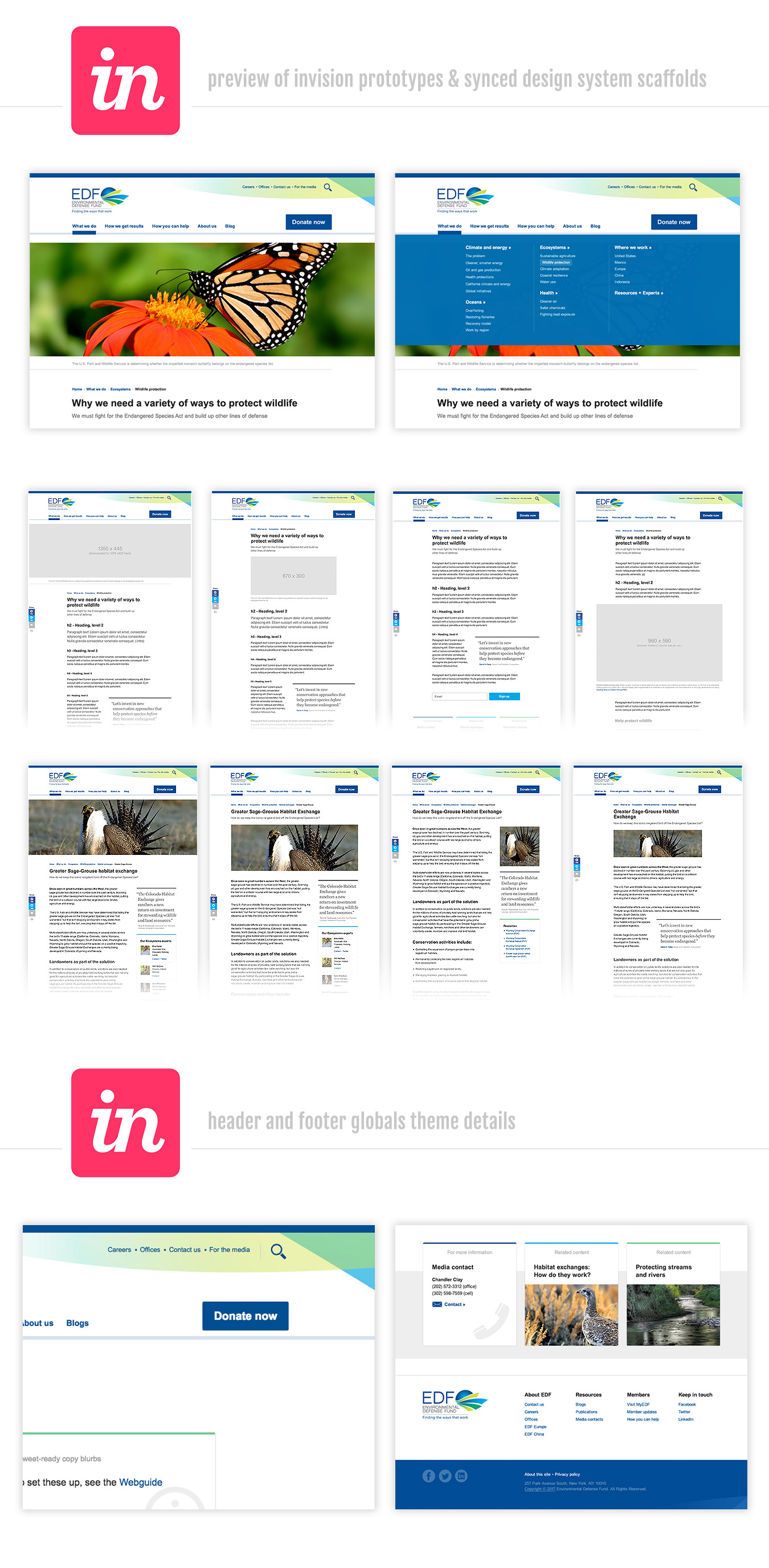
I led the majority of the project from scoping to design to front-end theming, ensuring consistency and focus throughout each phase. Knowing we had such a tight timeline and scope, as the lead designer and themer on the team, I made the risky decision to try a new tool called InVision to sync my Photoshop artboard mockups to the app in the cloud. This allowed us to simultaneously design, share updates with colleagues, see simple hover animations, and for our PMs to go on stakeholder “roadshows” (presentations created from making hotspots on the synced mockups and linking them together in a certain order with related captions). The tool allowed for seamless walkthroughs of the evolving UI per the latter functionality and kept stakeholders feeling seen and heard from early on in the project.
Also, recognizing a potential risk of missing the impending deadline, I voiced strong concerns when no one else would speak up (and we were only about 10 days away from launch) and helped develop a “Minimum Viable Product” (MVP) approach with my managers to ensure the core deliverables were completed within the project timeline. The other CSS-savvy producers also jumped on the theming assembly line to help meet MVP. This strategy enabled us to meet our OKRs while delivering a polished, user-friendly site, empowered by teamwork.
The redesign received positive feedback from both staff and users, particularly for its ease of use and modern aesthetic. The new modular design system significantly improved the site’s maintainability and made updates far easier for content creators using simple code snippets that I documented but with consistent CTA patterns, and redesign of the membership forms increased donor conversions by 10%! For my part of the team’s hard work and significant improvements to the site’s UI, UX and engagement, I was awarded a spot bonus, recognizing the impact of the project.
Unfortunately, the site’s long-term stability was impacted by subsequent redesigns, at least 3 or so, driven by changes in management. But this particular redesign stood out as a pivotal site milestone that brought EDF.org into the modern web era, and it’s one of my favorite projects.