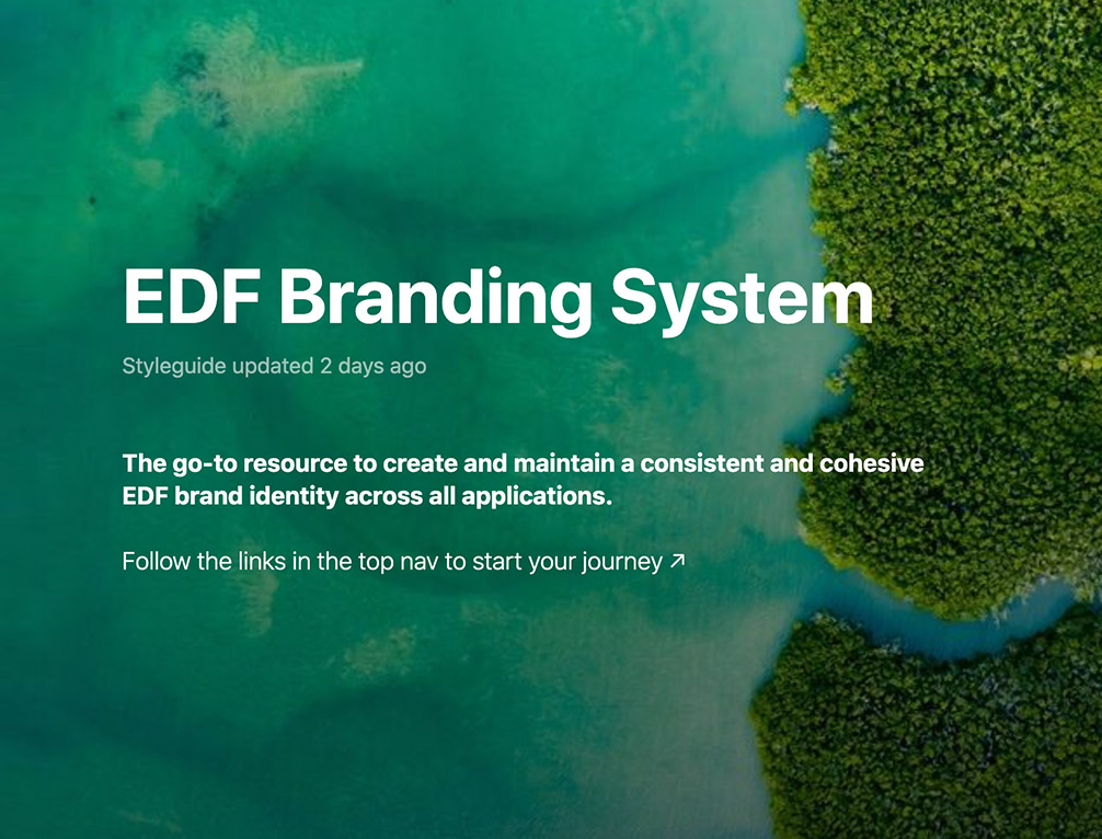
01. The Problem
Environmental Defense Fund (EDF) needed to find an elegant solution that could live online for all parties (in-house marketing and outsourced agencies, etc.) to reference our unified brand standards, and while we wanted most of it to be public, we also needed to password protect some of the more sensitive sections.
I had been playing around with one solution a few months before and was quite excited about it, but I was able to step up and pivot when it was clear this tool wouldn’t meet all the requirements set forth in the creative brief. We needed a tool that was flexible but could also be easily templated and updated by both technical and non-technical stakeholders.
We also wanted it to integrate with some of our current and upcoming internal tools including Figma, Storybook.js, GitHub, Slack, etc. We needed it to support our existing, mostly creative-based, documentation but leave room to grow and expand to support more technical content in the months and years to come.
02. The Solution
After I configured and experimented with a handful of potential tools, I landed on the zeroheight platform as the best solution and created a comparison spreadsheet to help sell my peers.
It was an active partnership between myself, as a hybrid designer and web expert, and the core creative team to coordinate on the content we’d add to the system for launch and to source the actual content and structure it in outlines to be input online. We all worked together with our project manager to keep the progress moving forward.
I trained the team on how to use the system to add and format documentation, supply downloadable content, etc. I was also the gatekeeper between the IT team and zeroheight support to facilitate the domain setup and move the project through to technically “launched” status. The overall timeline lasted from R&D in the late summer to content sourcing and structuring in the fall to official launch right before the winter holidays!
03. The Process
This project required seamless communication and cross-team coordination to be successful. Not only were the designers involved, but I was involved as the liaison between design and development teams as well as the writers due to my expertise and familiarity with all sides.
We set an official OKR (our success metric system on the Marketing Team meaning “Objective → Key Results”) to achieve development and launch of this project in the specified timeframe, and we obtained our goal during the sprint period to much excitement and satisfaction from our target audiences as well! Long gone were the days of multiple PDF references to juggle. All the branding guidance was now in one consolidated place.
There were challenges along the way, too, of course. One major hurdle during the R&D phases was finding a platform that would support analytics so the team could potentially see patterns and identify issues. To access this functionality in zeroheight, we would have had to increase our budget by $10,000 to receive these features. We decided to opt out of that solution but got creative with the “Provide feedback” option that was available in the footer of the entire guide. This launched a modal window above the current site page — making sure not to lose the user to an offsite location — that could load a custom-made form. We made a Microsoft form to collect strategic feedback, and in that way we struck a flexible balance between a full suite of analytics and no feedback of any kind, saving EDF thousands and thousands of dollars in the meantime.
I honestly can’t think of a better and more fulfilling + successful project in recent years! We really were a well-oiled, solutions-driven project team!
